Friday, 25 May 2012

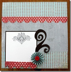
Concertina flowers

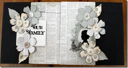
Using this lovely Sizzix die helped make this page however always bear in mind that one of two thicker embellishments will work but add too many and your album won’t shut when you add your pages.

IMG_5520

IMG_5521

IMG_5520IMG_5521

The scallop edge is one of my favourite punches. Pity I can’t find it under all my craft stuff. Note to Self – must tidy up.

Wednesday, 23 May 2012

Silhouette

Yes I’m a machine fan, Craft Robe, Sizzix, Cricut, you name it, I use it. This little beauty was cut out using the Cricut.
IMG_5516
IMG_5517
IMG_5516IMG_5517
I use silhouettes a lot in my smaller albums.

Stamping……my favourite

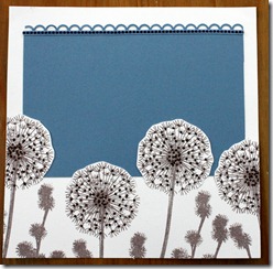
In both if these pages I have cut around the flowers and slid the blue paper underneath the flower heads.

IMG_5514

IMG_5515

IMG_5514IMG_5515

This is a beautiful stamp and using the stamp on white background with just the blue paper would make a great album.

Tuesday, 22 May 2012

Draped Flowers

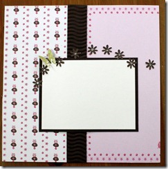
An easy way to add interest to your page is a line of punched small flowers and butterflies.

IMG_5510

IMG_5511

IMG_5510IMG_5511

A large flower can be used as a focal point.

Monday, 21 May 2012

Shapes

If you want to make fast layouts, especially if you are making an album for someone and need it within a short deadline, then using shapes is for you.

Here are two examples, the first using circles

IMG_5509

And this one using an oval as a focal point.

IMG_5512

I love this deep border punch.

Sunday, 20 May 2012

Valerie

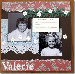
You either like tearing paper or you don’t, there’s no in between as I have often found in classes. IN this double I only had a limited amount of the patterned paper and decided the best way to use it all was to tear it through the middle. If you haven’t done it before give it a go. It’s good therapy.

IMG_5506

IMG_5507

IMG_5506IMG_5507

I love these photos of my Auntie Valerie. We lost her when she was still quite young and sometimes I still miss her.

Saturday, 19 May 2012

Birthdays through the years

You can make use of the patterned paper to provide your borders and this often means you need very little else.

IMG_5504

IMG_5505

IMG_5504IMG_5505

I like the idea of showcasing birthdays at different ages. I might use this again in a 12 x 12 page soon. Must get the photos out again. xx

Friday, 18 May 2012

A walk in the park

Darker colours also work well on an 8 x 8 page as show here. Although the circle on the left look drawn on, they are infact punched out of the paper with green paper behind to show through the dots.

IMG_5502

IMG_5503

IMG_5502IMG_5503

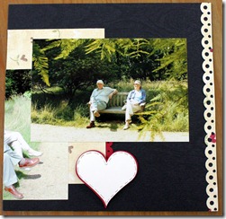
The threaded ribbon border is also a good look for the side of a page.

Thursday, 17 May 2012

A border punch

is a must when you make your pages. Sometimes plain paper doesn’t quite do it but with a border punch you can add a flourish in seconds.

IMG_5500

IMG_5501

IMG_5500IMG_5501

I loved using the velvet ribbon as well. xx

Wednesday, 16 May 2012

Stamping works as well

You don’t always have to have an embellishment to compliment a scrapbook page. Sometimes a stamp and a simple hand made paper flower will do.

IMG_5498

IMG_5499

IMG_5498IMG_5499

Still loads more to come so keep checking back oh and don’t forget to follow us and leave a comment. It’s nice to hear what you think. xxx

Monday, 7 May 2012

The first years

I have found that Graphic 45 papers work really well for 8 x 8 layouts and I especially love the train papers from Playtime Past.

IMG_5494

IMG_5495

IMG_5494IMG_5495

More layouts tomorrow

Sunday, 6 May 2012

Double Album

Someone asked for a bigger album for the coffee table so that it could be left out for family and friends to look at. I thought about making a thicker album but in the end decided to make a double.

IMG_5480

IMG_5482

IMG_5485

IMG_5487

It holds loads of layouts. Needless to say, it is now full up. Oh well, better make another one. Don’t forget to watch out for the tutorial coming soon. Thanks for looking. xx

Saturday, 5 May 2012

If you’re making

8 x 8 pages then you will need a 8 x 8 Album. You could go to a shop and buy one off the shelf but then you are restricted by the designs that are available. A much better idea is to make one of your own.

That’s exactly what I decided to do and this is the result of my first attempt.

Front

IMG_5489

Back

IMG_5491

Side view

IMG_5492

I didn’t buy a chipboard album and cover it, I literally made the whole thing.

Tomorrow I will show you the coffee table double album that I also made in a class, and later this year I will do a tutorial to show you how it’s done.

Thanks for looking. Please leave a comment if you like what you see. It’s always nice to get a bit of feedback. xx